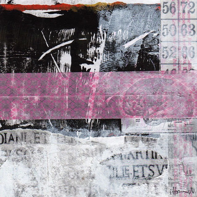
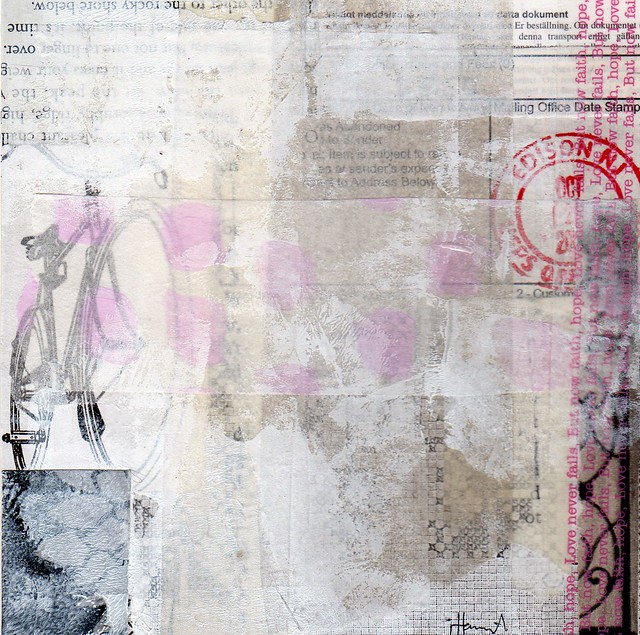
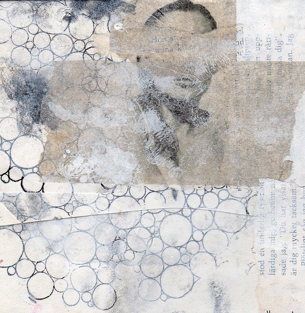
365 Collages | Week 42
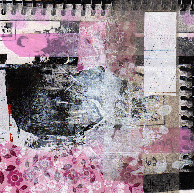
Before my Time
As I hope you’ve all noticed I’ve set up another autumn round of the Do it Yourself Postcard Swap! I even sent out my rare newsletter! You can read about it here and sign up if you feel inspired to create a few fun postcards to send out to the world! I will share what I am doing with my postcards soon, but I can already tell you that it involves small pieces of scrap papers put together in new combinations! :-)
Today I’m sharing collages of week 42. My scanner does not like the neon pink, but I do – a lot. I hope you can imagine that the pink washi tape and pink paint spots in these black and white collages are actually neon, not baby pink.
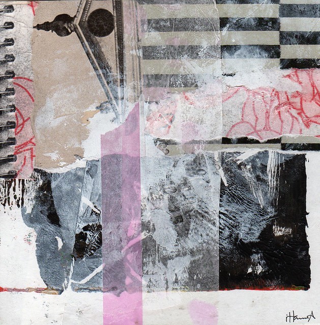
Scream over the Roof Tops
Feel free to share your opinions in the comment section below, I appreciate your “eye” on my collage work a lot.
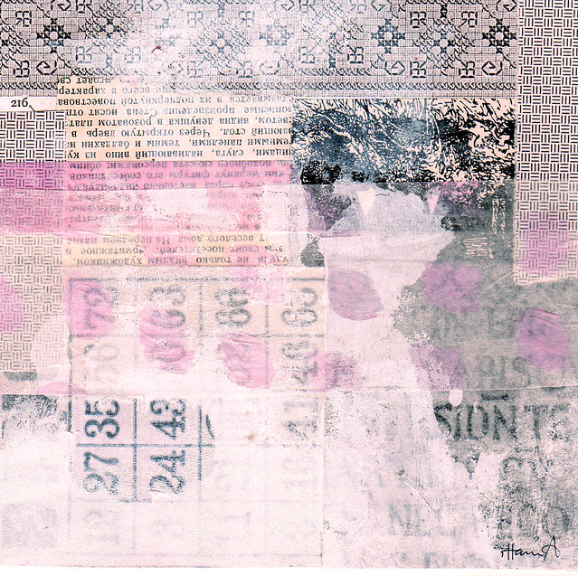
Free-falling
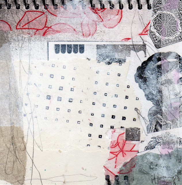
I am looking for You
I Fall Down
To the Rocky Shore
And now, you’ve reached:
Rock Bottom
Thanks for your visit – and comment!
This is a post in my series 365 Collages in 2013 | Previously: Week 41 | Next Up: Week 43 (rather shabby chic collages)

WOW, realllly loving this ones!! I think the free falling one is my favorite and all the others tie for second place. The neon pink is a great color for these collages too!!
Thanks so much for sharing these, so inspiring and fun each time.
I did notice your postcard swap on the home page right away, YAY!!! Hoping to join in this year for my first time.
Loving “Before My Time” and “Scream Over the Roof Tops” the best this week because they really seem to draw my eye around the piece and I could look at them for hours — but they are all wonderful! I especially like the naming of them this week, it kind of tells a little story in itself.
I really love all the layers and indeterminateness of these. I think they’re some of your very best!
I absolutely love these, Hanna! So many layers create such mystery, yet they are light in color which adds a nice contradiction! My faves are Free Falling & Rock Bottom…so hard to pick a favorite!
These made me GASP. (loooooved them.) “I am looking for You” is my favorite – the bit in the middle put me in mind of a calendar, of the days ticking by, of the patience and dedication necessary for waiting. But I also really love how wistful “Free-falling” is – to be honest, I can’t picture them in neon pink because I love them so much in blush. I’m trying though haha!
Oh Hanna! I always enjoy your collages but I love these especially. I just feel like I could fall into everyone of them.
I love Free Falling and I Fall Down. Great color scheme this week, I’m in love. I would love to see the neon pink you refer to but honestly, I love how they look with the soft baby pink that is showing up. Quite lovely.
Rock-Bottom is totally clever. Love it.
Fabulous! I can imagine the neon and how awesome it looks with the black and white !
Awww, thank you for leaving such nice comments! I feel like dancing now.
I’m particularly drawn to Rock Bottom and Looking For You this week. They all share an extra layer of obscurity…..did you use a bit of paint/gesso or is it maybe a layer of tissue paper? Whatever you did, I like the feeling – like you’re looking through a lacy curtain.
I love them all, Hanna. Well done!
Have a nice weekend :)
beautiful collages! i am a textile artist in the uk and you got me with the textures and that muted colour palette! great to find you! just about to start an alternating creative saturday linky myself…one week sketchbooks, the next pictures diaries of out workspace! would be fabulous if you brought some of this lovely work over to play! next week is kick-off and it starts on a sketchbook week! xxx