Scanning vs. Photographing Collage
I am back with square, abstract artwork. I made a few collages this spring, but never got around to posting them then. Now I really want to get back to creating art and sharing it with you guys, so let’s just start!
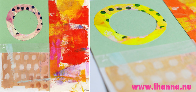
The reason this one didn’t get a blog post was mostly because my process includes scanning the artwork, and some pieces of art does not look good scanned. My scanner, for example, does not understand the concept of florescent colors, and those are some of my favorites to use right now!
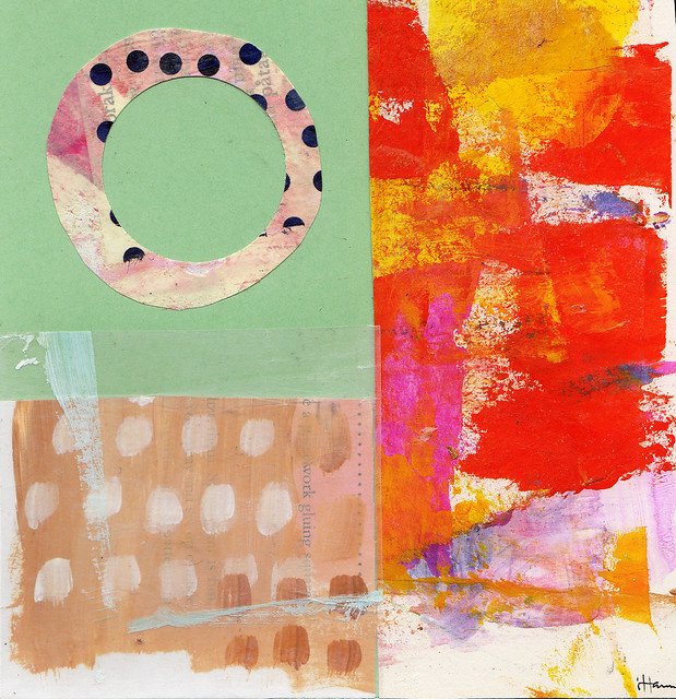
Just look at the piece above, and then imagine that big circle is actually neon yellow….
Photographing flat art is another option, when scanning doesn’t work. But to me it feels like a bit more work, probably because I’m not in the habit of doing it. And I like the scanner process: getting the artwork into the computer, dating and naming it, moving it to the folder called Collages 2014 and uploading it to Flickr.
With photography it’s more work. You’ve got to have good light, a flat background and then it’s still not easy to get all the angles 100 % straight. But I did a trial today and this is what it looks like in real life:
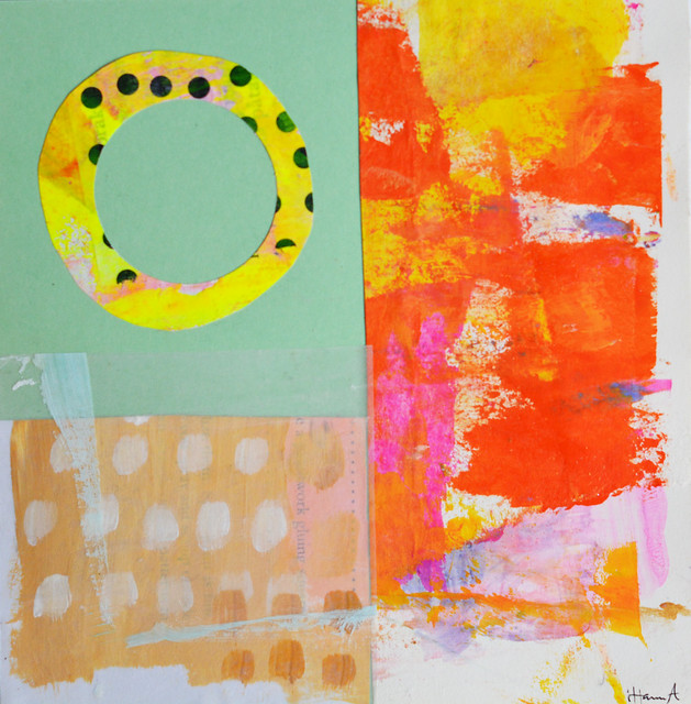
It’s kind of different from the collages I made last year, but I really like it. I like the white space, the circle, and that neon yellow is yummy. But maybe this image is blurry, I can’t tell right now. What do you think?
I listed it on etsy anyway, if you’re interested. That sad thing of a shop is poorly neglected, as is my newsletter, but maybe I could work on that too this week…

Hanna, I’m amazed at the difference in the colors in these examples! I always scan my collages for uploading, mainly because I’m a terrible photographer — I don’t have a steady hand, and my camera is very low end — but I’ve never experienced this problem with the colors being so different. I wonder if the cause might be the =type= of paper being used rather than just the color? My collages are all made from recycled paper, mostly magazine paper, so it’s never really flourescent even when bright, but I’ve still never seen the color totally change like in yours from yellow to pink.
YES! I am not alone in this after all. I am dealing with this right now myself. I have (what I consider) a nice scanner and yet when I scan my artwork I feel like it just does not pick up the detail. It’s almost like the light on the scanner is SO BRIGHT that it blows the details out. The details that I speak of are the subtle things like paper texture. For a typical person scanning, they may not want to deal with paper texture but as an artist we want every minute detail. I just created a piece in watercolor for a stationery design and when I scan it, it just looks so flat but I want to see all the surface texture. I often end up photographing pieces as well because I can get so much more detail. I always wondered if that was proper or not. I have heard before that the local University here and a local framing business will shoot professional digital pictures of artist’s work for them for portfolios (CDs or slides), so I’m assuming that since they do that rather than scan it, that it might be more standard than what we think?
and when I say that it blows out the details, that is even after I bump up the resolution to like 1200 so that I should have crazy amounts of detail
Love the collage! yeah, I take a lot of photos for my etsy shop and for some reason certain fabrics will not ‘come through’ in the photo; the colors look very distorted. For other fabrics, the colors come through just fine. Haven’t figured that one out yet!
What a wonderful collage, full of wonderful colors in the photographed edition. I usually photograph my collages because scanning sometimes creates unwanted shadows from the raised edges of pieces glued on. I agree that photography means more work due to the need for natural lighting, but I love it so :)
99% of my art is photographed rather than scanned. I feel like I have more control over photographs. I’ve learned to use the early morning or late afternoon light to be able to capture the varied textures. But I agree – shiny paints and neons are hard to capture.
This was a very interesting comparison! I too have trouble with this. Sometimes scanning turns out beautifully, but sometimes it’s terrible. I’m still working on figuring how to to photograph my work well. Thanks for sharing!