365 Collages | Week 38
A self-respecting artist must not fold his hands on the pretext that he is not in the mood…
Tchaikovsky
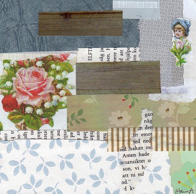
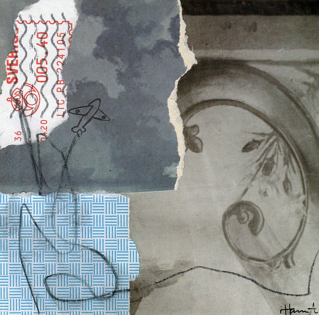
Hidden from view
After a week of Week in the Life-documentation with heavy photo posts I’m back with a collage-only-post. Art, yay right? But I’m not sure I personally like any of these collages. I don’t hate them, but they feel sad and maybe that is why the titles are kind of depressing too… Soul-less.
I was going for a sophisticated look, but the mood felt wrong. I hope you don’t mind, or that you can help me see them differently.
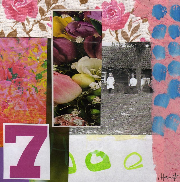
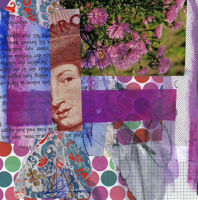
Here they are anyways, seven newly made collages:
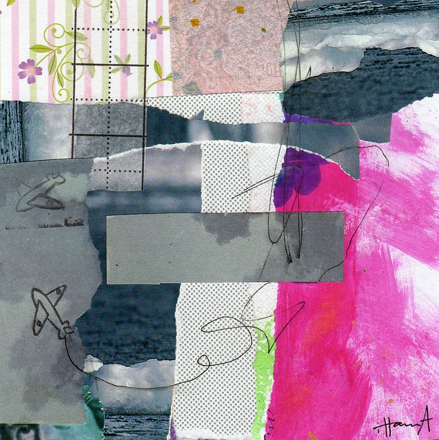
Unpresented evidence

Sailing through the Storm
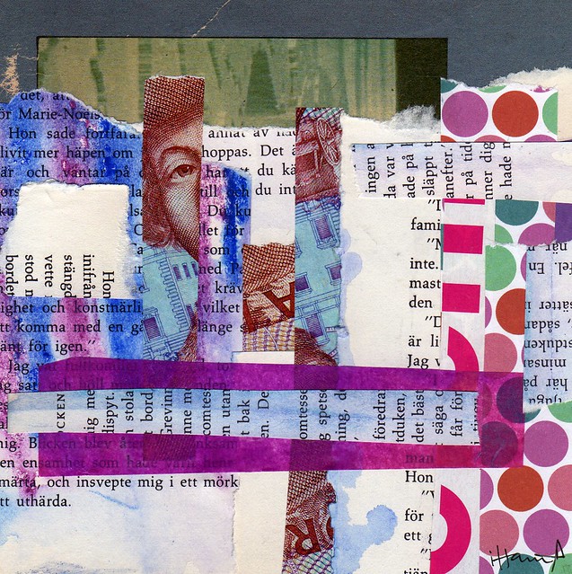
Being broke(n)
Broken Up
Going Away
Going Down
Do you feel the darkness? Or do you see something that I am missing? Let me know what you think in the comments! Thanks.
Wishing you a good Glue it Tuesday, where you also might want to check out my post from yesterday where I shared an idea on how to use glue and tissue paper!
This is a post in my series 365 Collages in 2013 | Previously: Week 37 | Next Up: Week 39 – on October first!

I don’t really care for flowers, but the other stripy, scrappy ones are terrific. I especially like 4, 6 and 7–love the trails from the little planes!
I like these a lot. What do you do with them when you are finished?
To me, they lack either a story or some colour. They don’t really grab my attention. I like the airplane “exhausts”, the old photo with the horse and I was reminded that I have some Swedish bills from before they had a magnetic strip, so probably I can’t buy anything with them, might as well cut them apart and play since I’m making postcards at the moment! So not all bad after all I guess. ;-)
art makes the soul visible……
i love the first one….but then again i have my table coverd in scraps and these romantic stickers and i was going to make cards with these….i love all your cards even if they don’t immediately evoke the greatest of joys…..it’s life in the 365 cards in the year :) your darker cards are fascinating and their titles leave place for imagination!
I think the mood is definitely “darker” than your usual collages but still Hanna. I love the plane and its doodled path. You are awesome and so dedicated, Miss Hanna!
I like Sailing through the Storm. It’s limited color palette is peaceful.
I like them – they are more somber in their color palette than your usual but they feel very “fall-like” to me! I especially like “Hidden From View”, “Unpresented Evidence” and “Going Away”. The stormy blue strips in “Going Away” are so interestingly arranged. They don’t immediately grab your attention and scream “Here I Am!” but they have a quieter, more introspective quality. Just like the difference between summer and fall. Very inspirational work again this week!
These collages seem a bit busy and frantic. Very nice but not the usual calming, serene collages you’ve created. I love your dedication. WoW!
I like the first one and going away ones best! I can see why you think this, some are more darker and not bright and COLORFUL as usual. Even still they are awesome to me though, love seeing them.
Have just made my first one yesterday!! Not sure how often this will happen but really want to this too.
Thanks so much for sharing and inspiring!
I like your collages! But sometimes we aren’t happy with what we are doing, it’s life! And it happens to me too!
I like Sailing Through the Storm, with its watery effects and imagery.
Dark art doesn’t bother me, and sometimes I’m drawn to it. I definitely have a limit to that, though. I don’t think these are particularly dark. Isn’t perspective a great thing to study? Everyone has a slightly different take.