365 Collages | Week 22 – Black & White Edition
“Good” can be a stifling word, a word that makes you hesitate and stare at a blank page and second-guess yourself and throw stuff in the trash. What�s important is to get your hands moving and let the images come. Whether it�s good or bad is beside the point. Make art.
Austin Kleon [via]
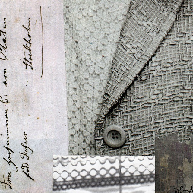
Loved from Afar
Week 24 has already begun! And I haven’t been keeping up with seven collages per week. I’m behind but I’m trying to catch up and I feel optimistic about it. I will create a whole lot more art this week, now that two major deadlines has past. For week 22 I kept it simple with a black and white scale. And while I wanted to “be done” quickly, again I found how much I love working in black and white! Love excluding almost all colours and just letting the texture and line talk. Love! I hope you like them too. Please let me know what your favorites are in the comments! Thanks!
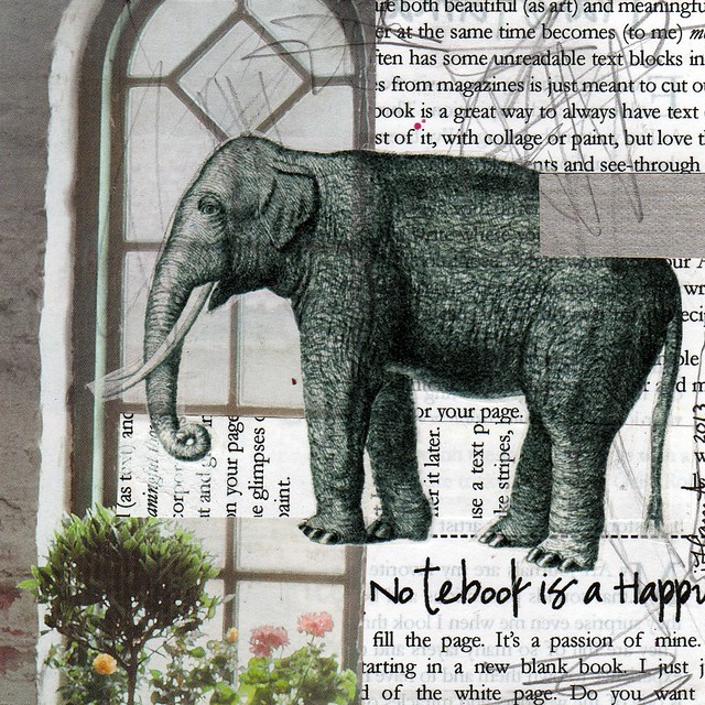
Elephant in the Window
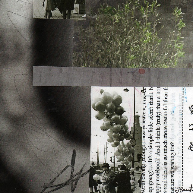
What are we waiting for
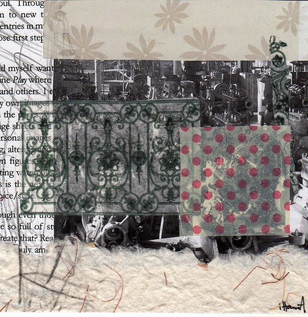
Gated World
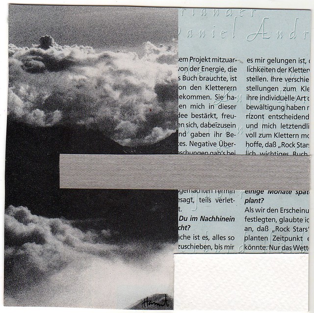
High Above Everything
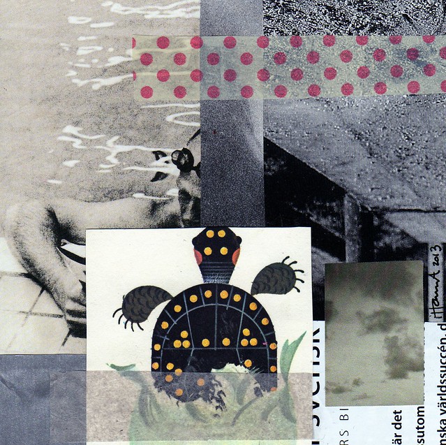
Beach 2013 – are you ready?
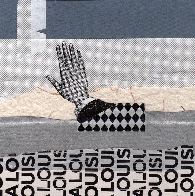
Wave to Lousiana (the art museum in Copenhagen that I love)
Quite a big change in colour use from collages of week 21 don’t you think? But experimenting is fun, and you learn a lot about what you love when you do it. I hope you’re finding time for creativity this week too!
This is a post in my series 365 Collages in 2013 | Plan Your Own 365 Project | About my Creative Process | Previously: Week 21 | Next Up: Week 23 (the Pink Edition)

“Loved from Afar” is simply perfect! I can’t stop looking at it!
I also like “Beach 2013” for those delicate touches of color that give life to blakc&white!
Great job, Hanna!!!
Awww, thank you Silvia! I guess I thought they were all black and white and then some pink polka dots just slipped in! How strange! :-)
I like these colors.
I just love the last one. But second one with the elephant is also very nice.
Wonderful quotation, Hanna, and I love that elephant!
I love these. And I love that the colors are different from the other collages. Our art, just like our lives, can’t be colorful and bright every day!
There’s something so special about B&W…these are all beautiful & I love how they each have their own personality! I am drawn to “Gated World”… I think because of the many patterns & textures. As always, your work is inspiring!
I love the black & white theme! …first one = awesome (bc I just love handwriting – that piece to the left is great!)
Beach 2013 – Yes! I am… the turtle makes the cut for me ;)
The last collage is speaking to me too.
Cheers! …and thanks for stopping by :)
I always look forward to seeing your collages. I love that you selected the B&W theme. It’s hard to pick a favorite. I guess “Loved from Afar” would be my favorite but I also like What are we waiting for and High above everything. Thanks for sharing. I often work in colors, so this inspires me to try B&W soon!
My best is “wave to Louisiana”, for me it’s just perfect. The composition, the choice of papers, and what it emerge for that, my English vocabulary is too poor to explain very well, sorry!
There is something soft and cosy about the monotone hues of grey. I like the tiny bit of faded color in some of them too.
~Dawn
You are right – black and white is special and wonderful! It draws the attention to shape and form, and these sparingly used colours are delicate! Hanna I they are all wonderful, but I fell in love with the elephant!
Cheers
Gabriele
what a wonderful collection of collages for GIT!. I love the beach and am SO ready for it so of course I’m partial to that collage :)
Wow! Super art! I love your captions for each picture,too.
P.S. I have a question: The picture of “altering a book” tutorial- shows a pink book with a white spine. What material did you use as the white spine?
Thank you
Hi Nancy Lee, thanks for leaving a comment! In my tutorial on how to alter a book I have covered the cloth with white paint, and then made a collage on the front that has a lot of pink in it. So the answer is: just paint to cover the original book title! The texture of the spine is simply the original fabric that shows through the paint. I hope that helps? :-) You can also buy cloth tape (intended for book binding) in white.
What a fun change to work in black and white. I’m particularly fond of elephants and hands so those two collages are my fave, but they’re all great. And you’ve inspired me to play in B&W a bit, so thank you for that.
talk about texture! Your first piece is alive with texture. I love turtles, so your Beach has to be a close second fav! {:-Deb
Hi, Hanna!
I hope you are doing well. I’ve been away too long.
I know what you mean about B&W ! I was taking only BW photographs near the end of my college work in photography because I just loved the graphic and textural qualities.
My favorites were hard to pick, but the first one, Love From Afar, is stunning! I love that one and the Elephant In the Window the most.
Hanna, what beautiful colors and textures in these collages…
The three layers of the first one work so well together!
“What�s important is to get your hands moving and let the images come.” I got to remember that! :-)
Great series – Black and White is nice to work with as opposite to all the choices we have in color, I might follow you and create some b & w’s myself this week… My fave is High Above Everything”
Wonderful as always.
Wonderful as always
Lovely collages – the b and w really changes the look!
Marvelous. I really like the ‘atmosphere’ of these.
your work is just as gorgeous in black & white!
My favorite is the last one and the image of the elephant looks awesome.