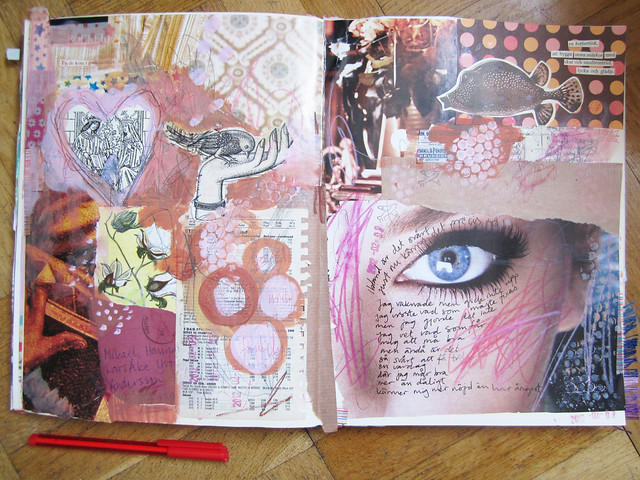
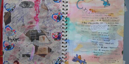
Art journal peek: A Very Brown Page
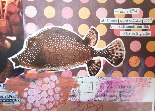
Fishy poetry in my art journal.
en koffertfisk,
att bygga stora snäckor med
ekar och smultronträd,
lycka och glädje.
Found poetry poem by iHanna. Translated it would sound something like this:
a “trunk fish”,
to build big shells together with
oaks and wild strawberry trees,
happiness and joy.
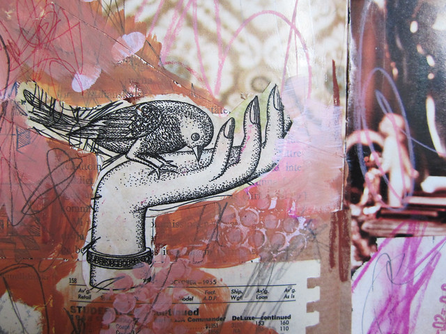
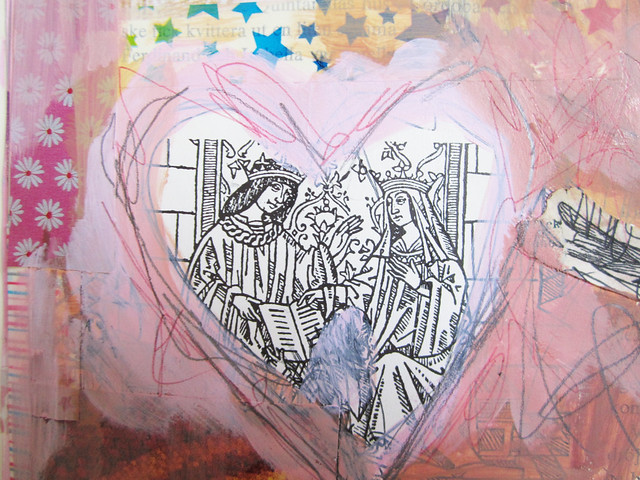
More brown details from a very brown page:
Outside my comfort zone
Brown is not a colour I use very often, but this was a very Brown Page indeed. This is me going outside my comfort zone, art journal wise. But I like what came out on the page. A quite messy page with a lot of different imagery coming together with the help of the surrounding colour: brown.

Brun �r den f�rg jag anv�nder allra mest (tillsammans med bl�tt och vitt), fast det syns s�llan i mina m�lningar. Jag blandar alltid f�rgerna f�r att d�mpa dem lite och d� �r brun (r� umbra) alldeles perfekt. Det skulle vara en utmaning att g�ra en brun m�lning dock, men jag gillar din kombination med rosa.
Tack f�r kommentaren Elin. Det �r s�na knep man (jag) �r d�lig p� eftersom jag inte g�tt n�gon konstutbildning. Jag anv�nder alltid f�rgerna direkt ur burken, och gl�mmer blanda egna kombos… fast n�r jag kommer ih�g att mixa lite mer �r det roligare att m�la! :-)
wonderful shapes and repetition Hanna! I think you rose up to the “brown” challenge very well! Love the fish :)
This is very nice. I’m not a ‘brown’ girl either but the pinky rosey hues make me love this. Also that bird in the hand image is so sweet. Love how it comes together as a whole.
the brown lend a nature look and feel to your page, which is visually very appealing. i need to branch out to different color combos since it is so easy to get in a rut with our favorites.
As always, very inspiring! I love the warmth of these pages. They are soothing without being boring…bravo for brown! I don’t use a lot of brown either but it is an excellent idea to try unfamiliar things.
I love these collaged pages! Marvelous!
I love brown! I use it quite a lot lately – so many shades and images, they make a fabulous page!
Love the collage elements you’ve put in here.
As I was reading your post I thought each close up was its own page- it wasn’t until your last photo I realized that they were from just ONE journal spread. Wow- so many fabulous details and layers!
I thought the same!
How cool, wow, I didn’t think about that possiblity. I usually share the big spread first and then the details… but this time I wanted to mix it up a bit. I hope it wasn’t confusing. I’m working in a coffee table sized altered book, so I can put a lot on the page. I love the mix. :-)
i like to see the details, then the how the whole page as a unit! well use of the color brown. i like the textures you used too. :)
Jag �r en obrun person, men jag gillar dina art journals
Very sweet pages, as always your pages are full of delight. ( I especially love the fish poem)