Found typography from the newspaper
The prompt: Use “found typography” as background in your art journal. Cut out text headlines from a newspaper or magazine and glue it on a page to create a background or a text message.
Material requirement: found type, adhesive, scissors and journal pages!
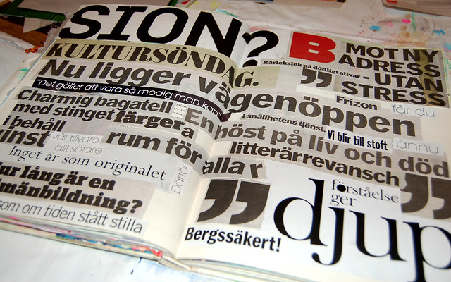
I cut out random words from a few newspapers and glued it all together rather quickly. I don’t think this is a finished page, and I am hoping that the next crusade will reveal something interesting to do to it, if not I will try to come up with something on my own…
Check out what others have made during August in crusade no 43: text messaging!

hanna – love the linear layout.
love the foreign text.
love the quotation marks.
love the one RED letter.
love it AS IS.
hang on until crusade number 45.
(yes, that means not september, but october)
thanks for sharing and getting it in before the end of the month.
bravo!
Thanks Michelle dear!
I will leave it as is until October though I’m dying of curiosity of course, hehe. I think I will do more spreads with words, I feel a colourful one coming on too as I’m surfing around looking at fellow crusader’s work!
Love that it doesn’t all tell a story, because it is hard to make good design with letterforms that people recognize. Love the quotation mark and the bold red letter. YES!
Thanks Quinn for coming by and commenting! I love those big quotation marks that they print in the newspaper to mark a quote lifted from the text. They are so yummy! :-)
I noticed a speaking bubble in the paper today and realized how easy it would be to cut one out of paper. I think the big quote marks would be easy to make a stencil out of to use again. See what you’ve started? ART!
Thanks for coming by my blog and your kind comment. I’m looking forward to seeing your text piece with color…but I always love black and white…I’ll check by later.
LOVE this absolutely and completely! And I love that one red B. Nice punch. :-)
skitsnyggt!
I like this a lot, Hanna. Go look at Joan Schultz’s website to see how one woman uses text, and has done for a couple of dozen years.
http://www.joan-of-arts.com/
Love the black and white Hanna.
And the red really makes the page!
Great contribution to this months Crusade.
Love the stark black and white and the red B. My fav are the giant quote marks! Very cool!!
Great page, the swedish words give it an extra dimension. I was so happy to use dutch words in combination with english words on my pages. Got some comments on that. Looking forward to what is going to happen in october’s challenge.
I think your page looks great as is. iIve typography and I like to see words in a foreign langage.
What a cool page!
Love it, Hanna! It’s big, bright, and just pops off the page! I have some forgein text a friend sent me, and I may ending doing yet another text page.
This is so big and bold, I love it.
Oh yes! That red B is awesome – although I guess that should be B for brilliant ;-)
Hi Hanna,
This really is a terrific page of typography! You laid it out beautifully, and like Michelle, I LOVE the one red letter!!! Brava, girlfriend, you rock! Hope all is well!