Art journal peek: Red calligraphy ink
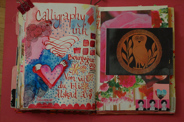
Testing out some red calligraphy ink on a page. It came in a bottle and I used a dip nib to write and doodle this page. Then I coloured around everything with some watercolours.
The right page is a taped in postcard with a Greek antique owl illustration. I got the postcard from a co-worker at Nova this spring. She found it at home when she was moving. And the owl made her think about me… How strange.

I think about you when I see owls too. I see a cute owl at flickr or on pinterest and I think… Hanna would love this! This vivid red ink is wonderful, and everything just pops against the red. Cool pages.
Väldigt snyggt!
The red ink is a great addition. Red always scares me a little–to bold. But here it has a heart-warming feeling. And I love the work you put on the rest of the page.
The ink is lovely, your doodles divine :-)
I love the look of the red ink with the watercolours snuggled in.
Beautiful.
Shannon
Cool spread! I think of you when I see owls too (and Mon from Bohemian Twilight). I don’t use red much. Must try using it more- it adds such a lovely pop.
Another vote for the red ink! Works really well with the watercolours. Great spread. I find the owl a bit scary tho lol!
Hej Hanna! Jag är fortfarande fascinerad av det där med Art journal, men har inte kommit mig för att göra något liknande…
Svar på din fråga hos mig: Pumlor är runda kulor, ett ord som kanske bara används i norra Sverige?
What a lovely journal! I was attracted to the circles. They remind me of labyrinths, which I love.
Simply beautiful, Hanna! :]
Love your use of colors, art elements, and the layout of the pages… *sigh*
I love it! You’re so talented!
Härlig sida! Perfekta färgkombinationer, som vanligt, och det där bläcket ser läckert ut!
I really enjoy your work. It is a treat getting an email from you.