365 Collages | Week 7
Welcome to week seven of 365 Collages!
The unintentional and serendipitous theme this week is cream as in the colour of cream… All of my seven artworks have some kind of bone white or off white bits to them, and most of them are overwhelmingly so. I feel they are rather calming to look at – and make. It’s like stepping into a spa just looking at them.
I would love to know which one of these is your personal favorite – and why? Let me know in the comments! Thanks.
A Gathering
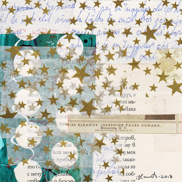
Letter from the Stars
Starstruck
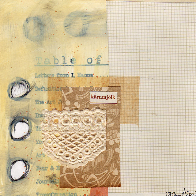
Table of Me
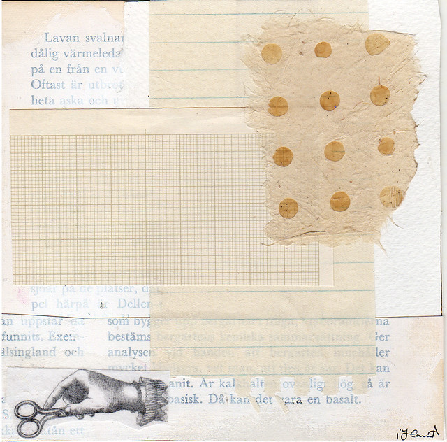
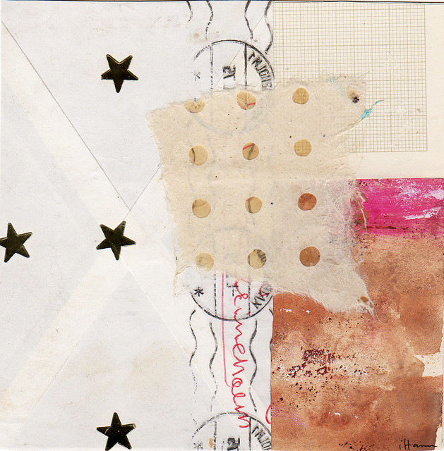
Pale in Comparison
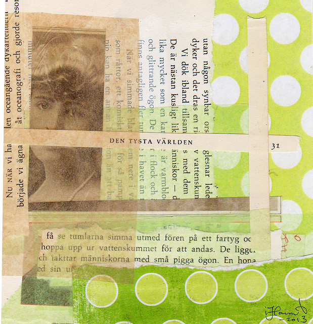
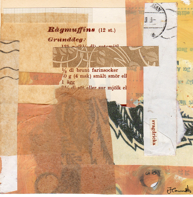
In Silence I sing

All of your collages are lovely! The colors are so soft and peaceful. It’s hard to pick a favorite but I really enjoy the beautiful energy of “Starstruck.” The layering and composition make it feel as if a waterfall of stars flows from the work to fall into my hands. It’s really quite magical :-)
I love “table of me” – I like the smeared paint circles you added. I love that the word content can mean both the table of contents pictured, but also mean happy and satisfied. plus I just love orange as an accent.
Letter from the Stars is my favorite, I think probably because of the contrast that creates interest, but they’re all wonderful!
I really like ‘A Gathering’, I love the juxtaposition of the simple drawn circle with the intricate fabric. Gorgeous work.
Very lovely! Pale in Comparison & A Gathering are my favorites!
They are calming to look at! Great job. Letter from the Stars is my favorite, and Pale in Comparison a close second; guess that i like them for their simplicity and also the hole paper they have in the center.
Love the cream. They are all so lovely! My fav is the gathering because of the circles and it seems to be pulling me to the surface and back under in a very nice way
I think this is my favourite week of collages yet! I am definitely a fan of the more muted colours, such as cream – they have such a simple, understated look about them that I really like. I think that by using more muted colours, you draw attention to things like texture and pattern instead. I think my favourites would have to be “Letter from the Stars” and “Starstruck”, because I love the gold stars and the postmarks in “Letter”. But I also really like “Pale in Comparison” for the contrast of the graph paper and the circles, and “In Silence I Sing” for the unexpected pop of green colour. I really do love all of these collages!
Wonderful collages. “A gathering”and “a table of me” are my favorites for the use of colors and “minimal”composition.
I love A Gathering! Those stark white and black circles are perfection. The creams in all of these are fantastic though. I’m so excited to be fully caught up today for the first time. Your scrap pieces post inspired five of my collages this week! Thanks so much for the inspiration!! xx
I have to say they are all lovely but I love “A gathering”. I find that I really gravitate to artwork that has a lot of white space.
I like Pale In Comparison the most!
Hanna, I love all of them but mostly “A Gathering” I love circles. I have Randle Plowman’s book and it is my collage bible.
A Gathering.